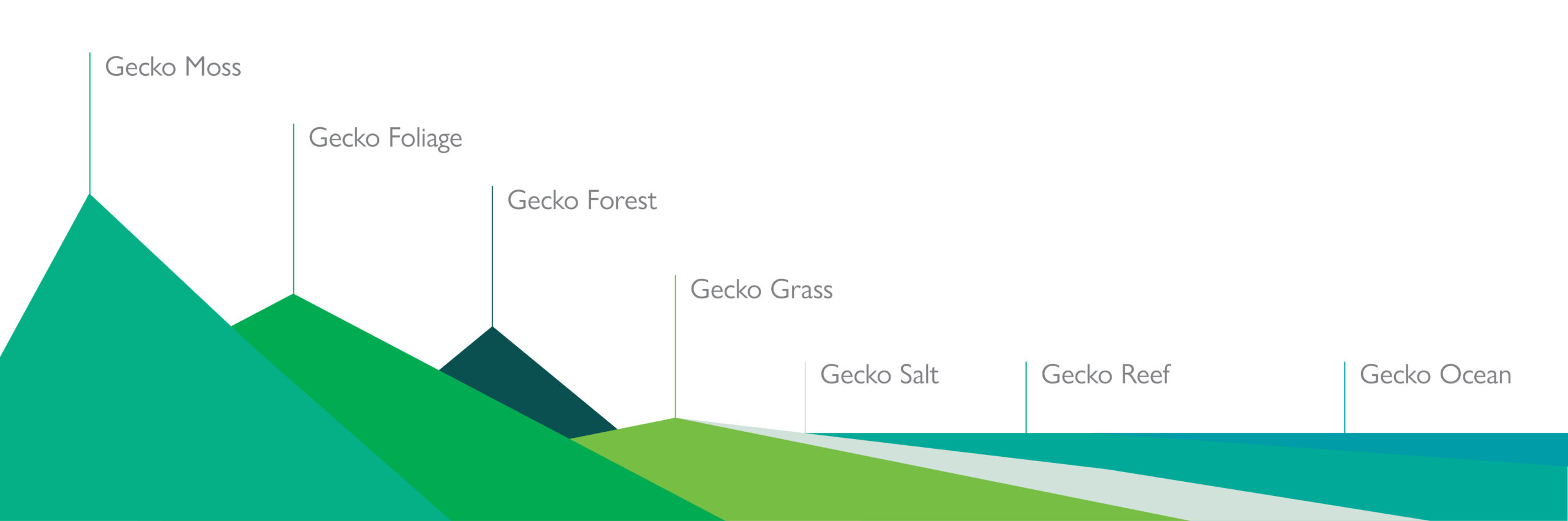
Inspired by the natural landscape
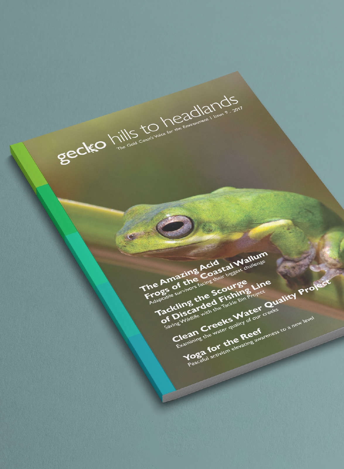
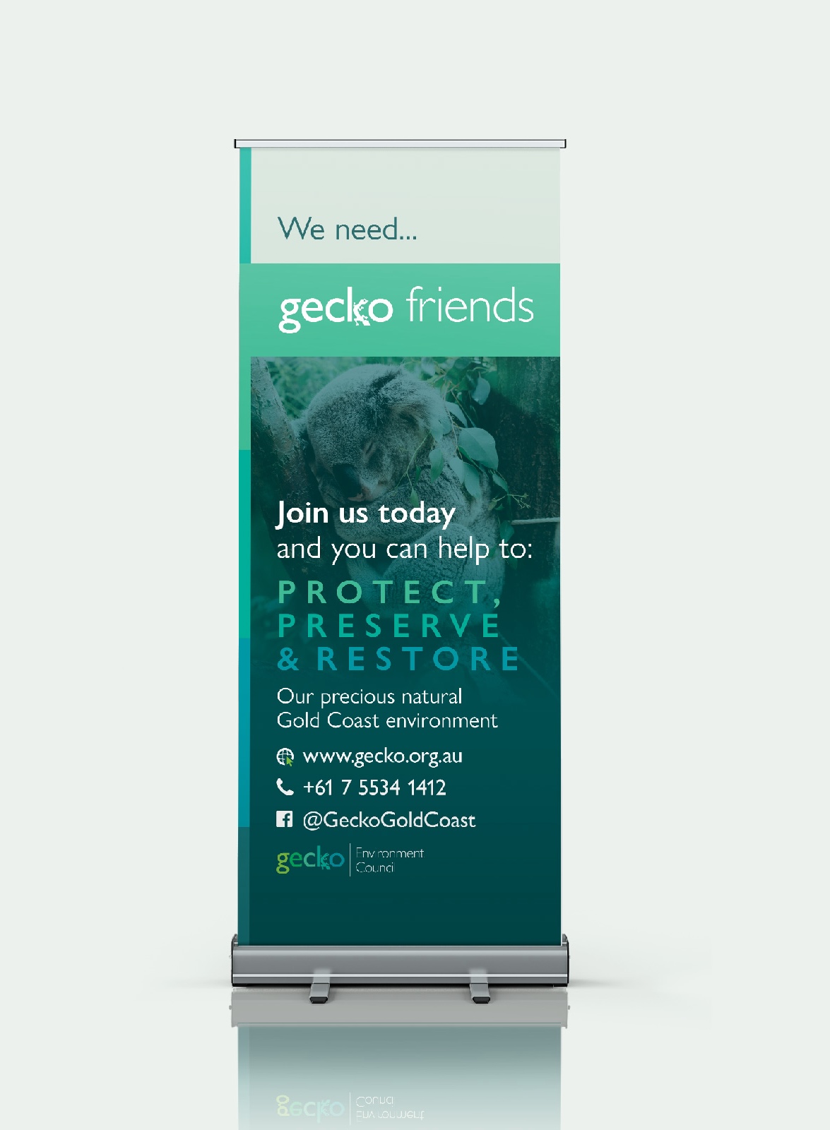
To define Gecko’s unique voice, the first step in creating the identity was to establish a definitive colour palette, to both distinguish and unite the various projects. The palette is informed by cues from the Gold Coast’s natural landscape.
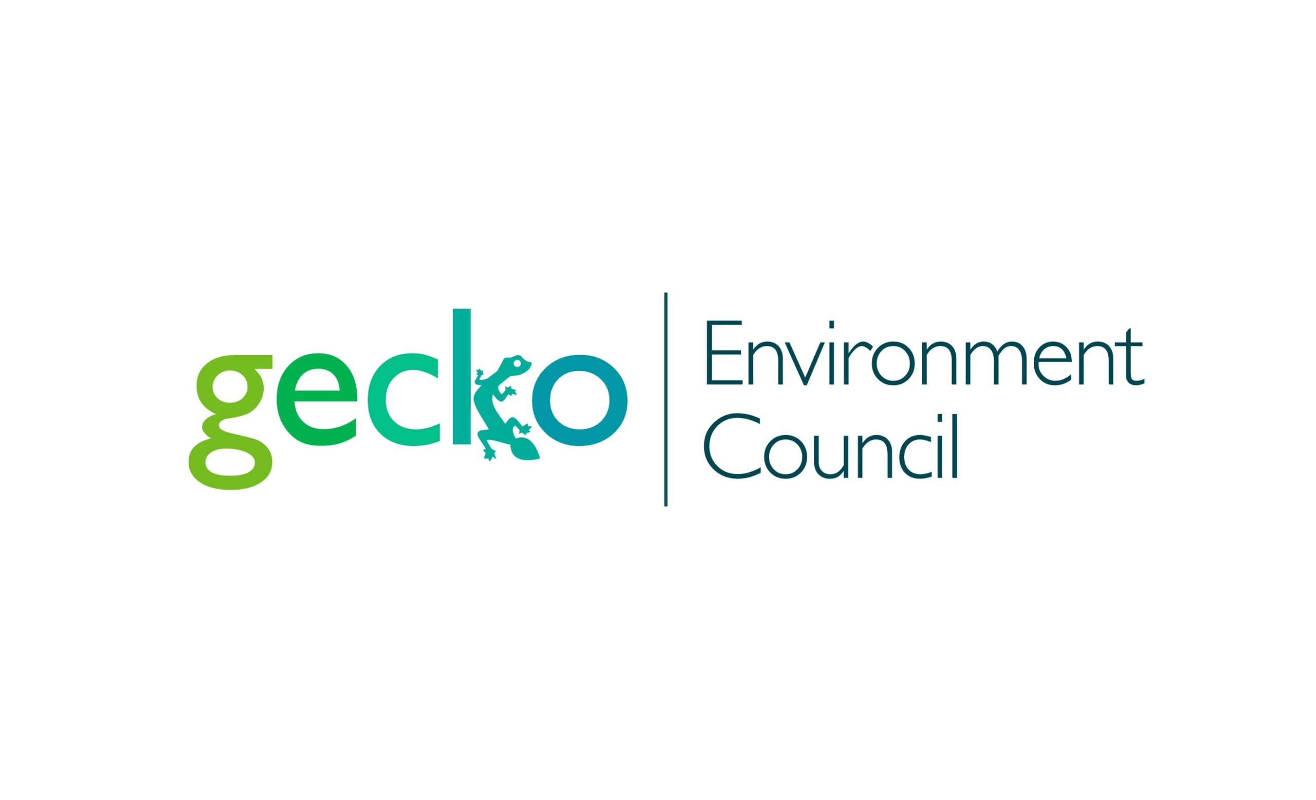
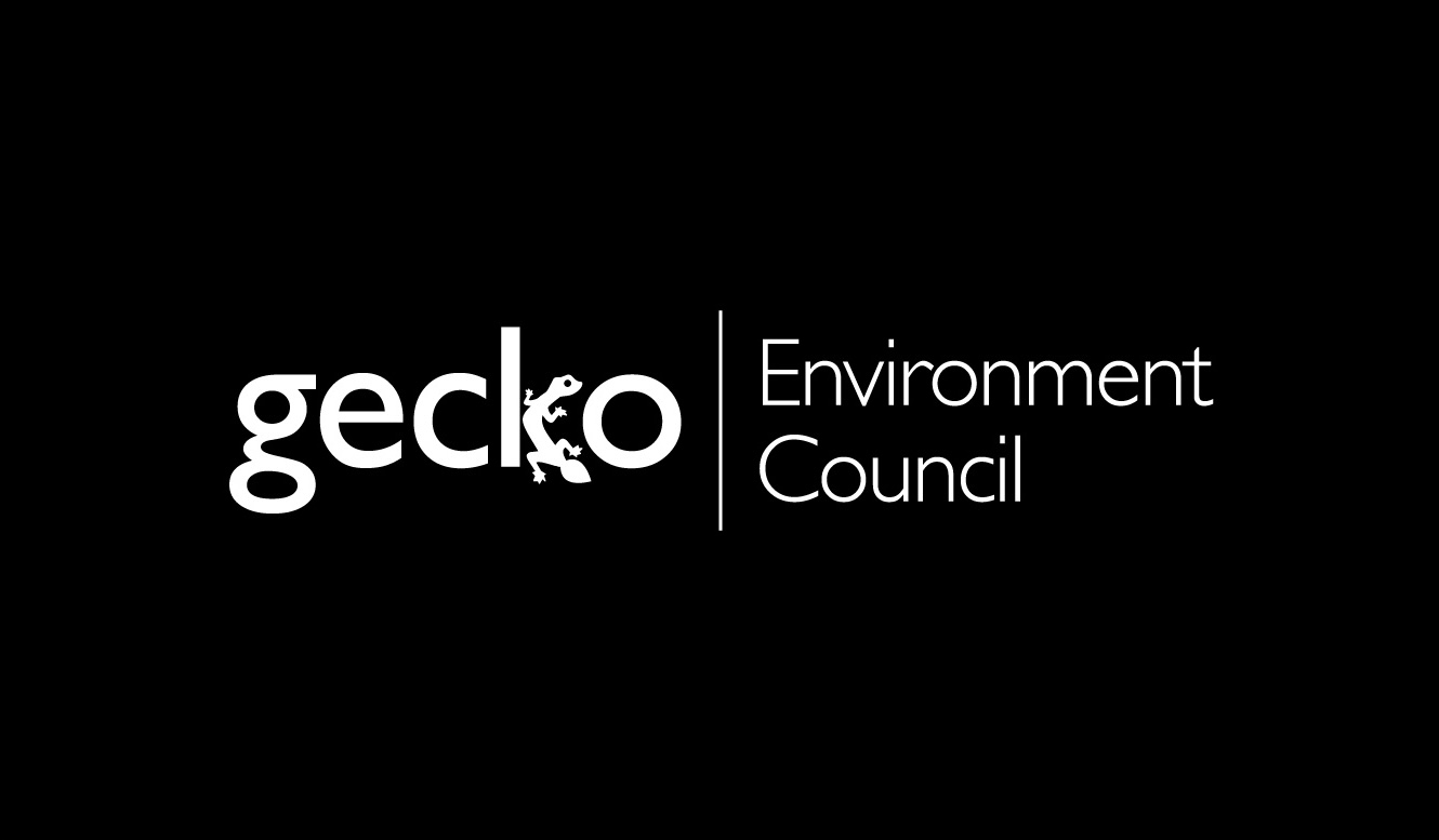
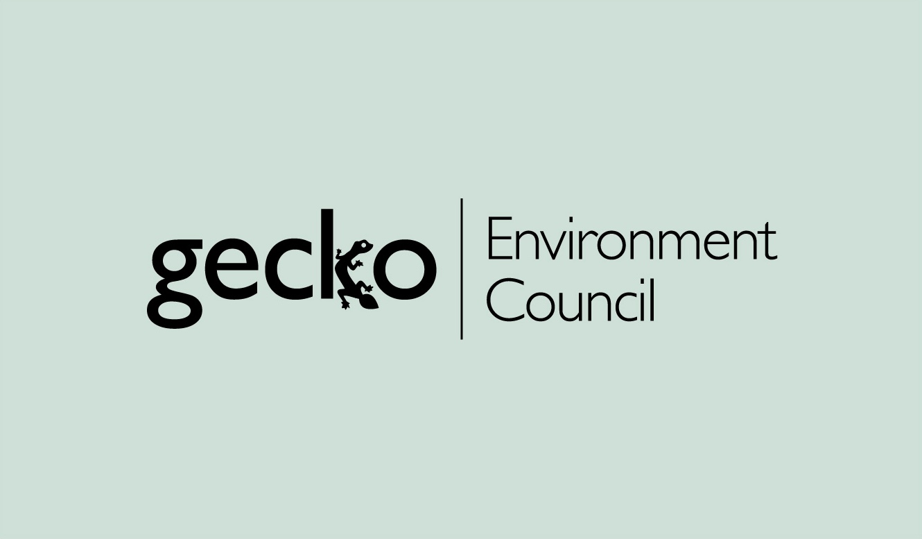
A revitalised icon
At the centre of the new brand is the new Gecko logo — a symbol which had to fit a very specific set of criteria: it must reflect the values and history of the organisation, work well in all media, be simple to reproduce, and provide a flexible platform for the various child identities. At the heart of the design is the famous leaf-tailed gecko mascot, a symbol that has been with Gecko since its inception, which has been given new life as a fundamental part of the Gecko logo.
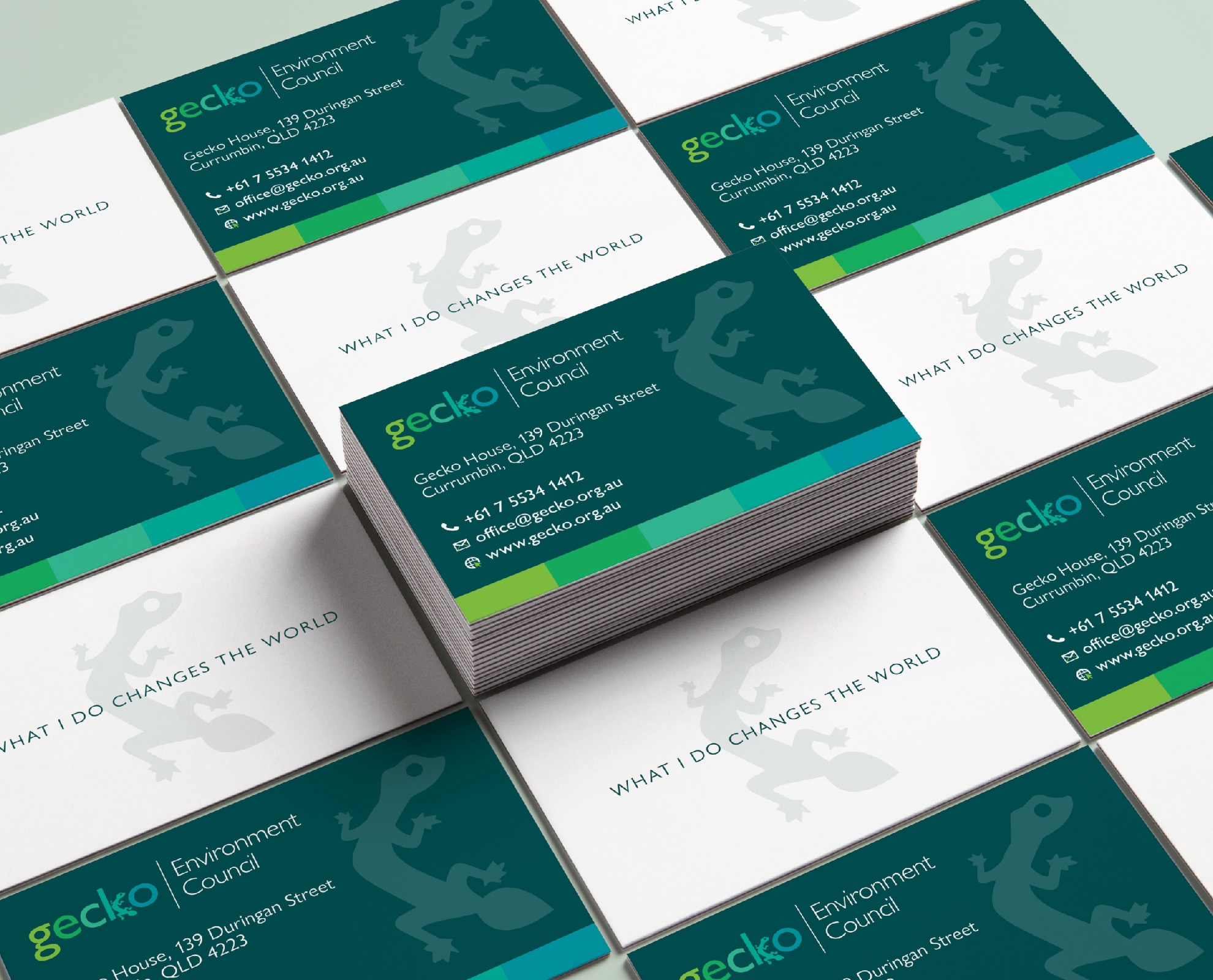
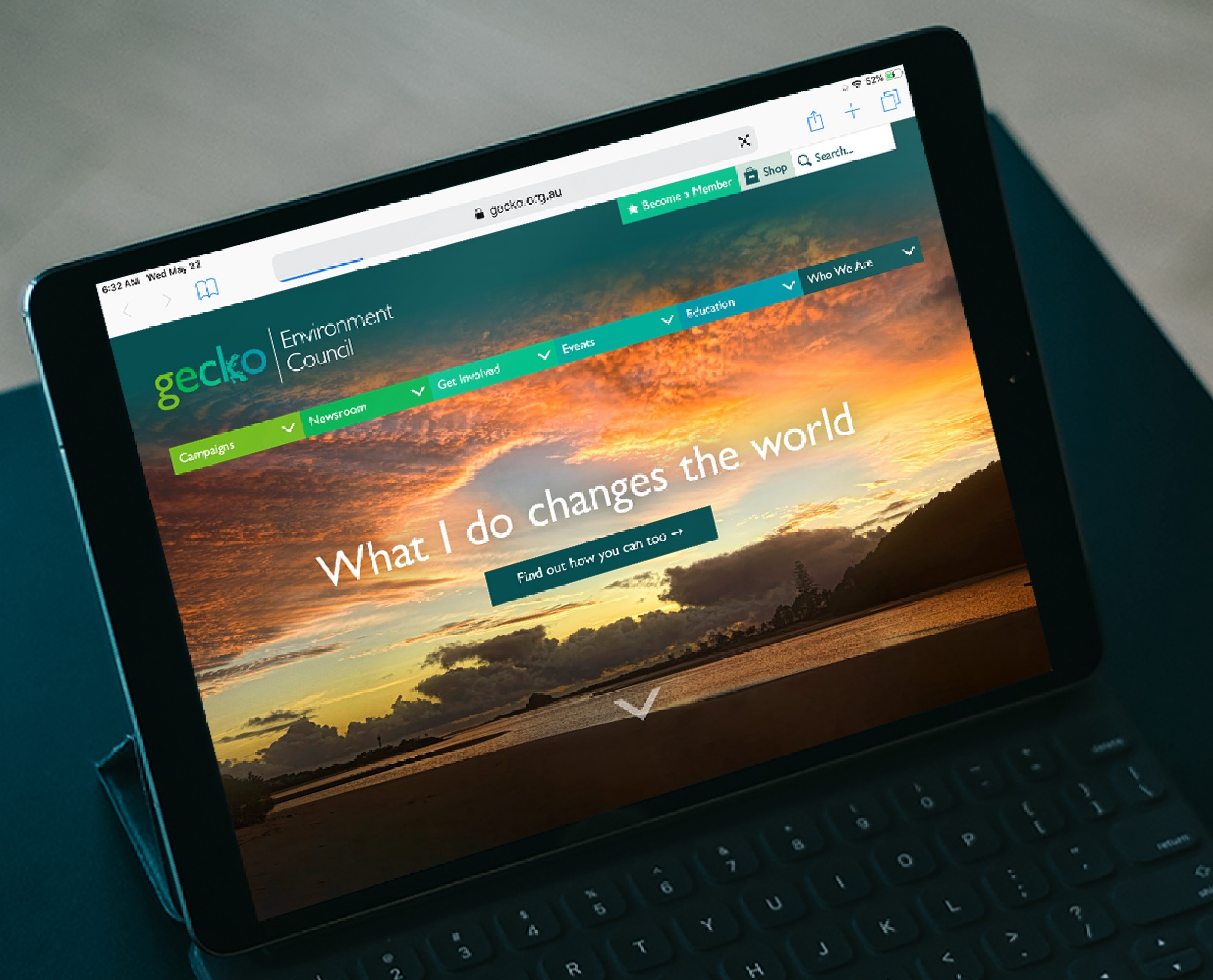
Bringing it all togeher
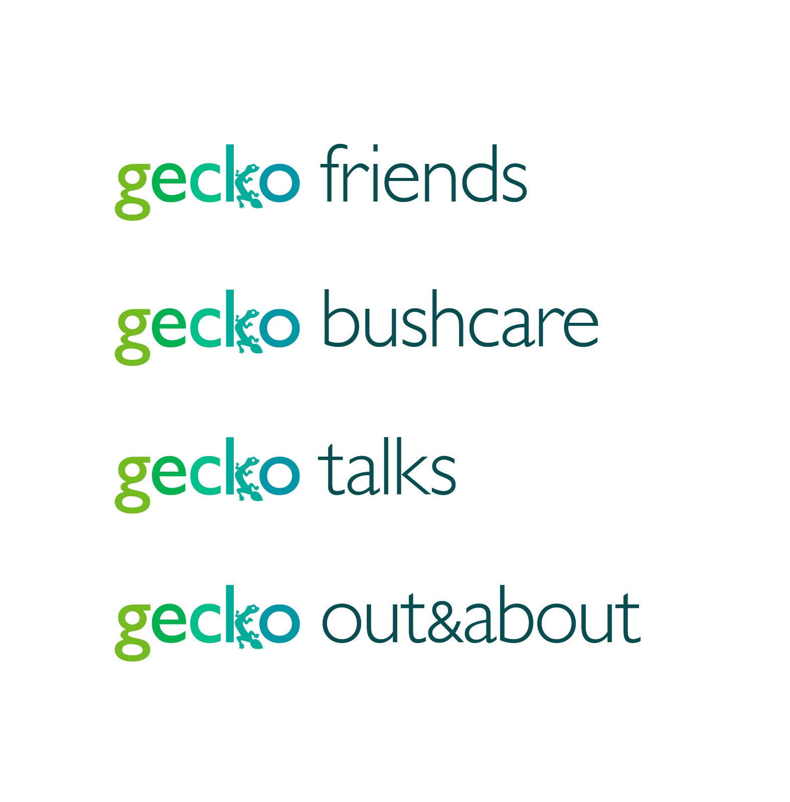
The new Gecko identity utilises a fixed-template approach to extending out from the master brand. This ensures the consistency of the brand throughout every project and initiative, whilst being flexible enough to give each project its own voice through colour and imagery. Most importantly, it’s simple and cost-effective to manage, while maintaining a high quality of visual design.
In Summary
The success of an organisation like Gecko is predicated on its ability to reach out and communicate its message effectively. The new identity achieves this by introducing consistency across the entire brand portfolio, enhancing the quality of design across the organisation, and most importantly, effectively communicating the brand’s core values to new demographic groups.