


The Icon
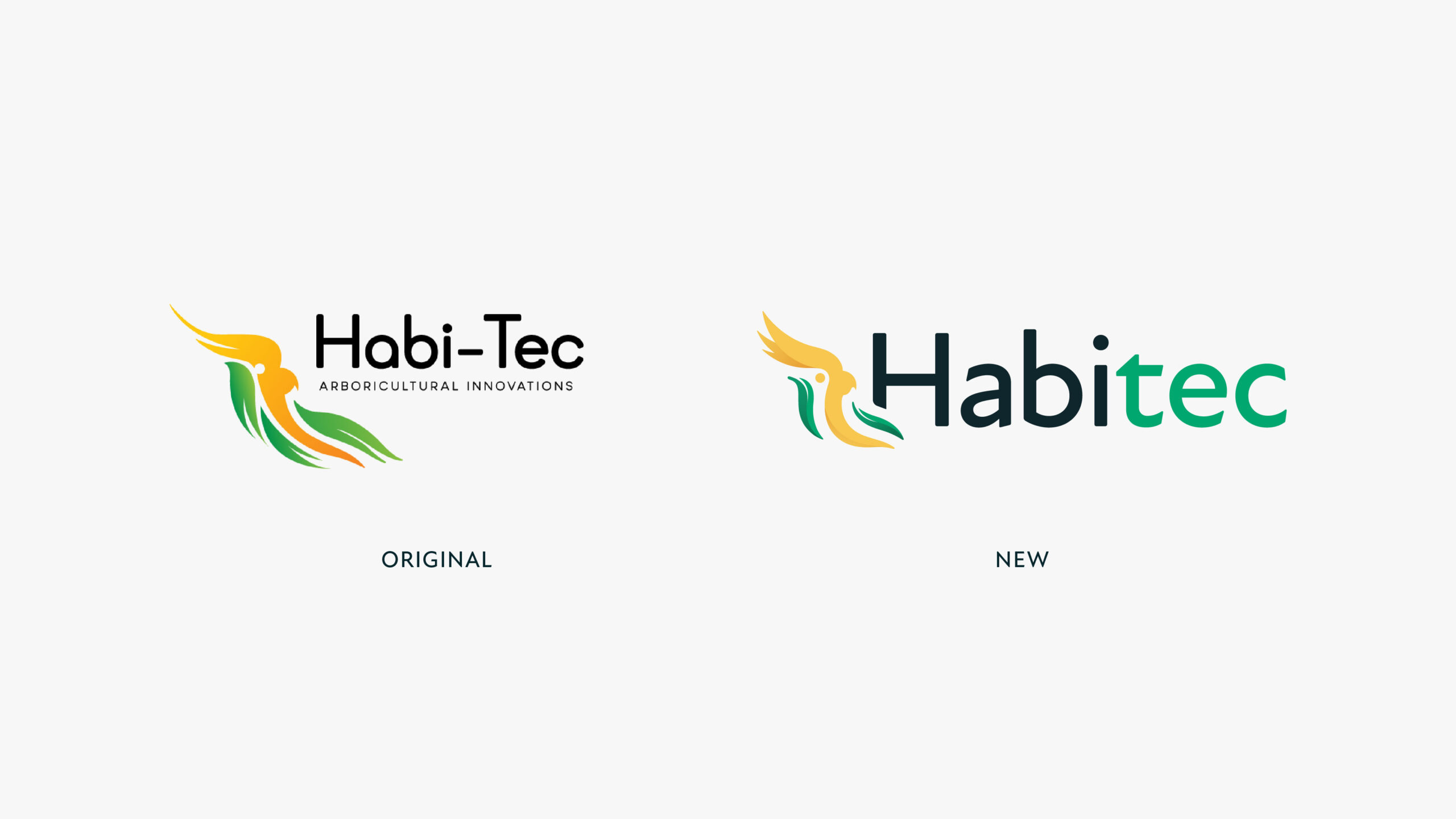
It was important to the Habitec team that we retain their existing gold-crested cockatoo motif, and refine it. We wanted to use this foundation to create a more considered design that functions harmoniously with the surrounding visual language.
The original design was based on a hand-drawn illustration by founder Steve Collum. We wanted to retain the natural, flowing curves that were present in that version. At the same time though, the new icon needed a level of precision and refinement that would allow it to integrate into a range of environments and uses. To achieve this, we refined the curves and geometry, balancing the design. We also utilised negative space to streamline and simplify the icon further. Subtle shaded highlights then add dimension to the logo, and create a sense of quality and authenticity. This emphasises Habitec’s industry-leader status.
Extending the design
The refined Habitec icon formed the basis of the identity, and helped us to develop a series of branded elements informed by the icon’s most signature components — such as the crest. These can be used in various crops and elements to echo the core identity across any branded material. The dimensional, curved gradients of the leaves and feathers are used similarly. The result is subtle, flexible and effective.
To provide more strength and versatility, we also looked to extend and refine the Habitec colour palette, forming an organic collection inspired by the natural environment in which Habitec’s work takes place.
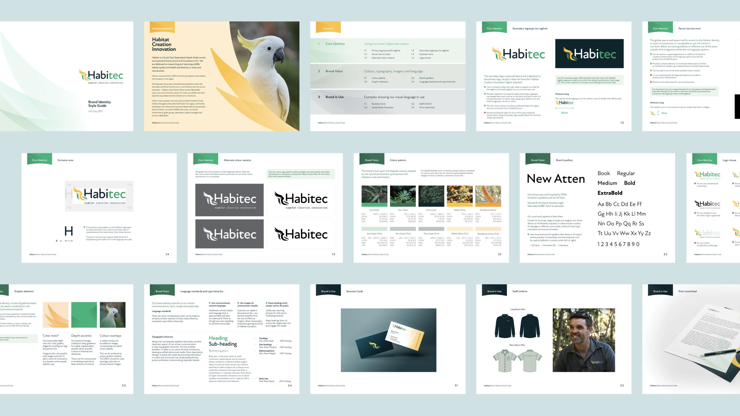
Typography
A significant part of the new identity system was choosing a consistent typeface to represent both brands, tying them together. We needed a legible, approachable humanist family that works great wherever it needs to be. New Atten was our pick — a typeface fittingly named after environmentalist and nature broadcaster David Attenborough.
To create the signature Habitec logotype, we integrated the brandname together with the curves of the icon itself, utilising the new consistent typography, and locking everything up together to create a clear, recognisable mark.
Taking it online
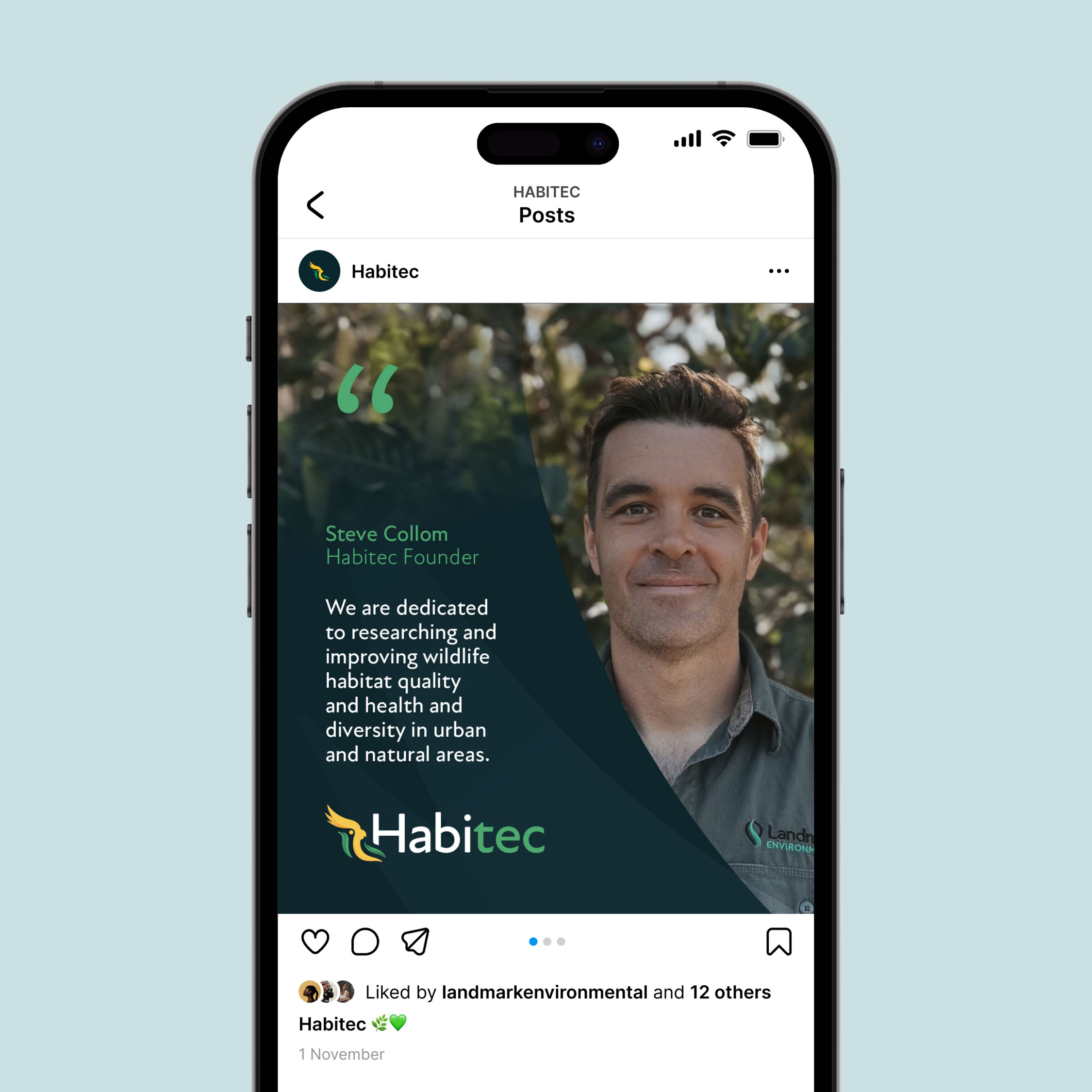
We created a bespoke WordPress website for the new Habitec. It was important that the new website reflect not only Habitec’s products and services, but also their renewed focus on advocacy and education. The structure is designed to highlight these components, and provides a rich content experience that engages and guides the user through each section. The new identity is also reflected throughout the design, echoing the design language across various components of the interface.
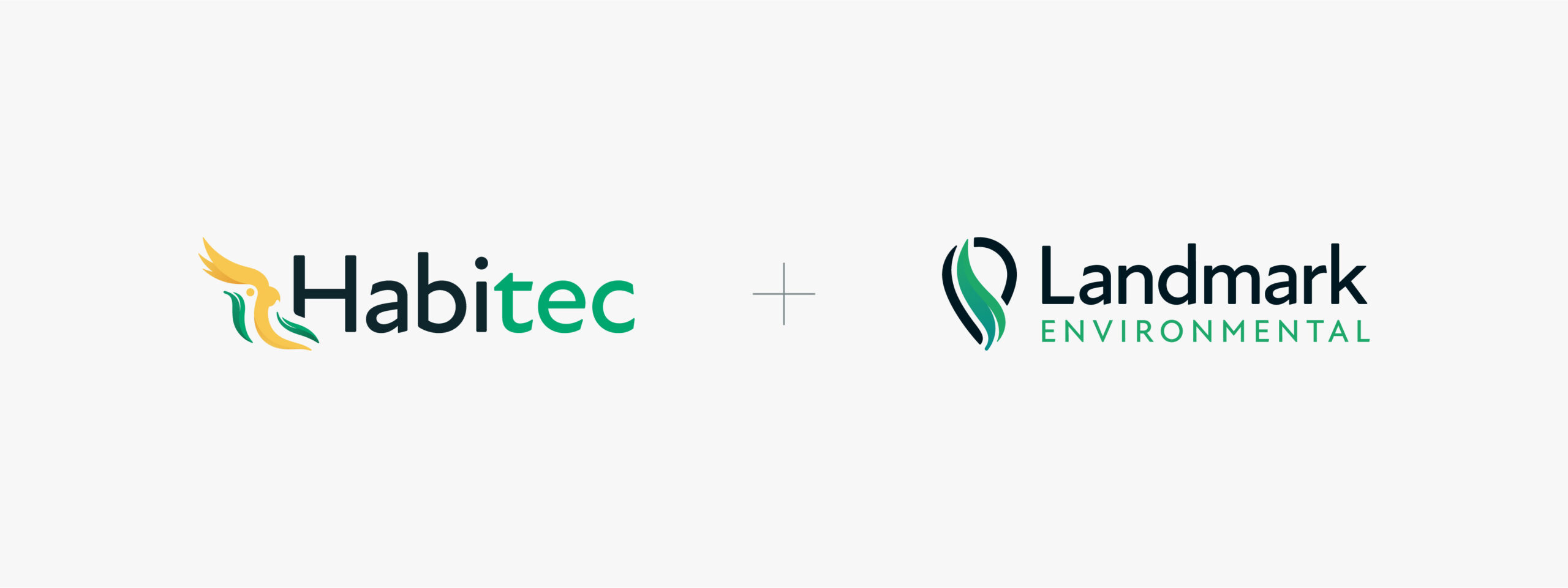
Brand family
As part of the Habitec project, we also created a fresh, new identity for Habitec’s partner, Landmark Environmental. The two brands echo similar themes while retaining their own unique iconography and properties. The result is a harmonious brand partnership that highlights their shared heritage.
A case study on the Landmark Environmental project will be available soon.