Ordering, easy as 1–2–3
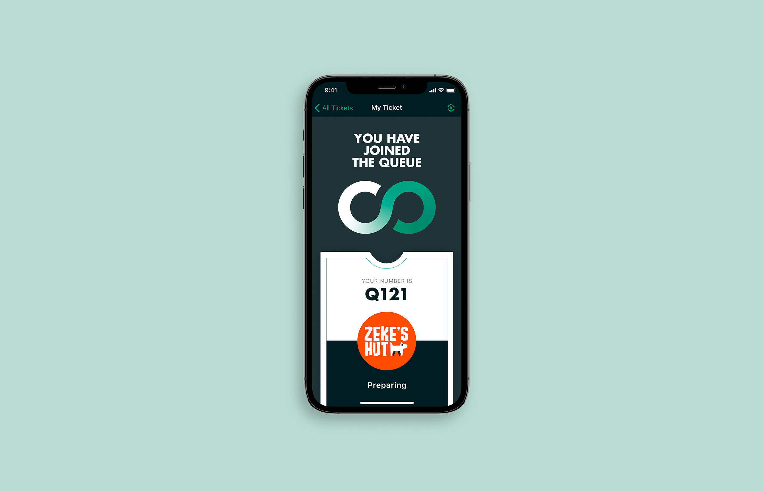
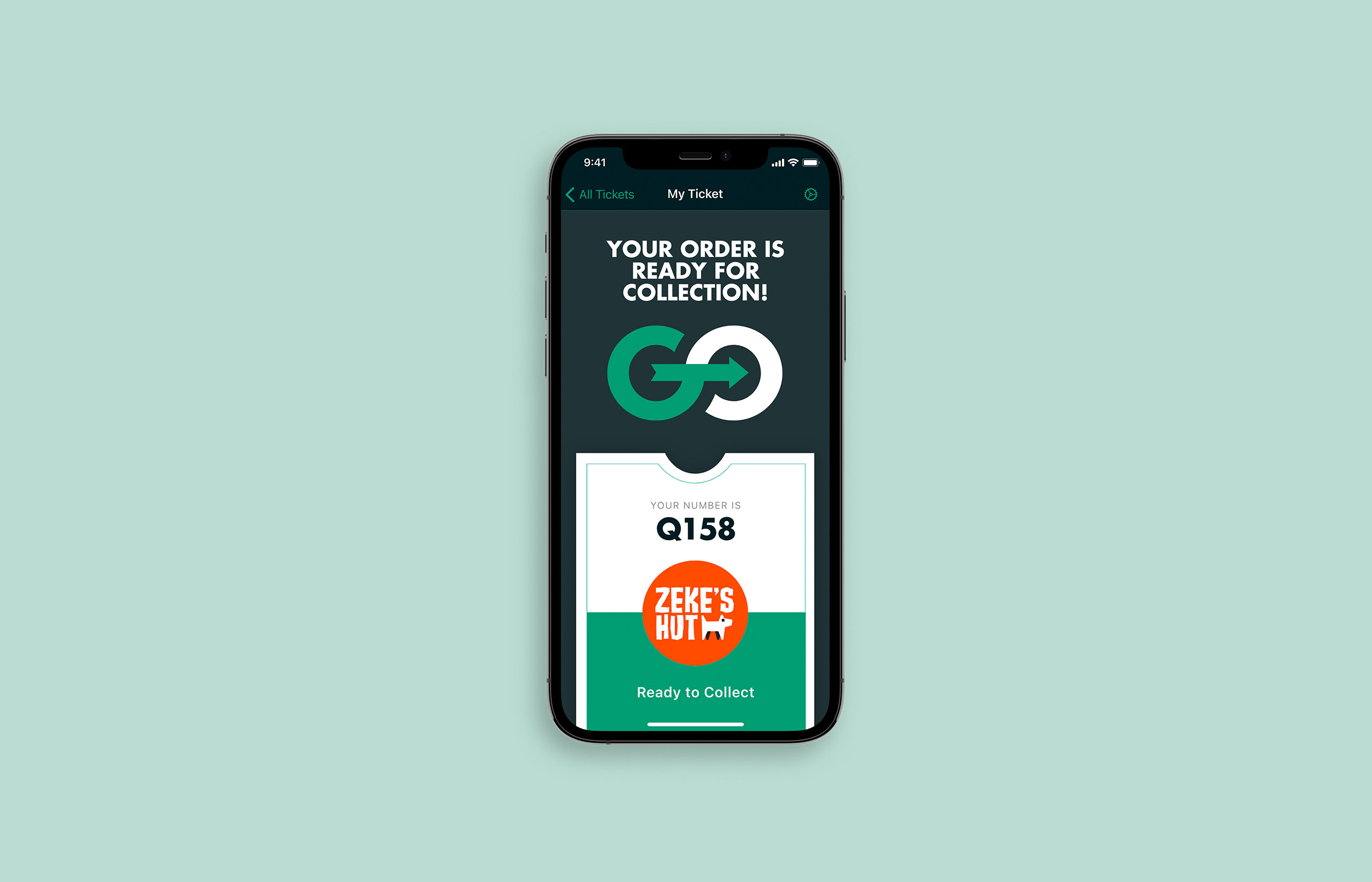
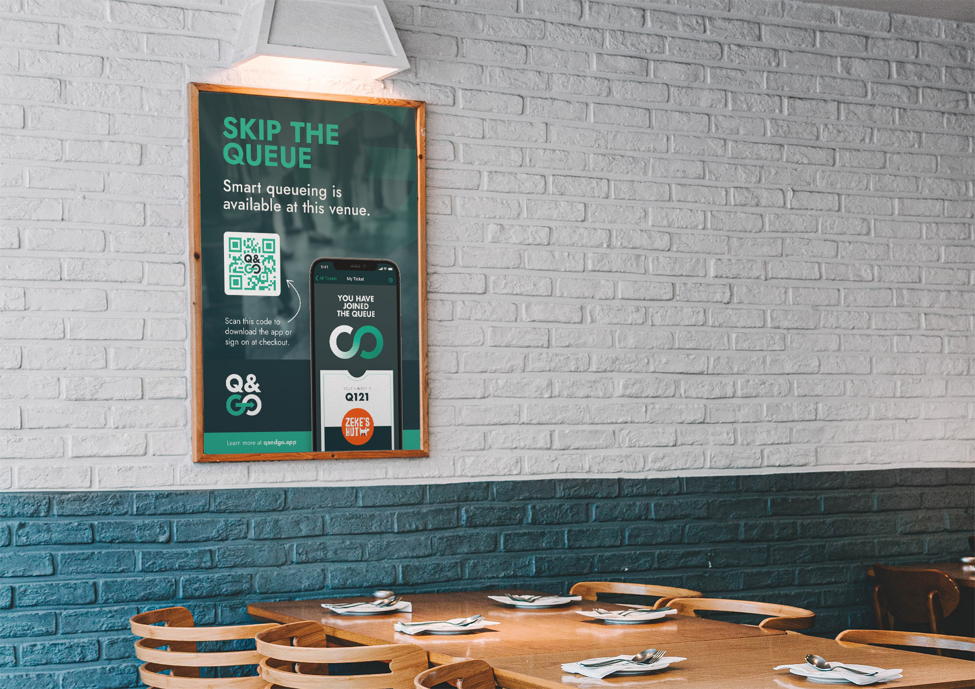
The philosophy of the Q&GO user experience can be summarised into a three step process: scan your QR code at the venue, get notified of your order being ready, and go!
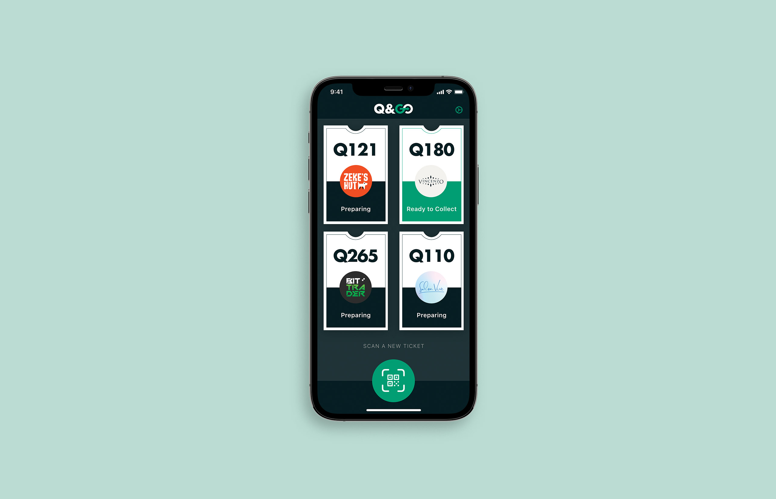
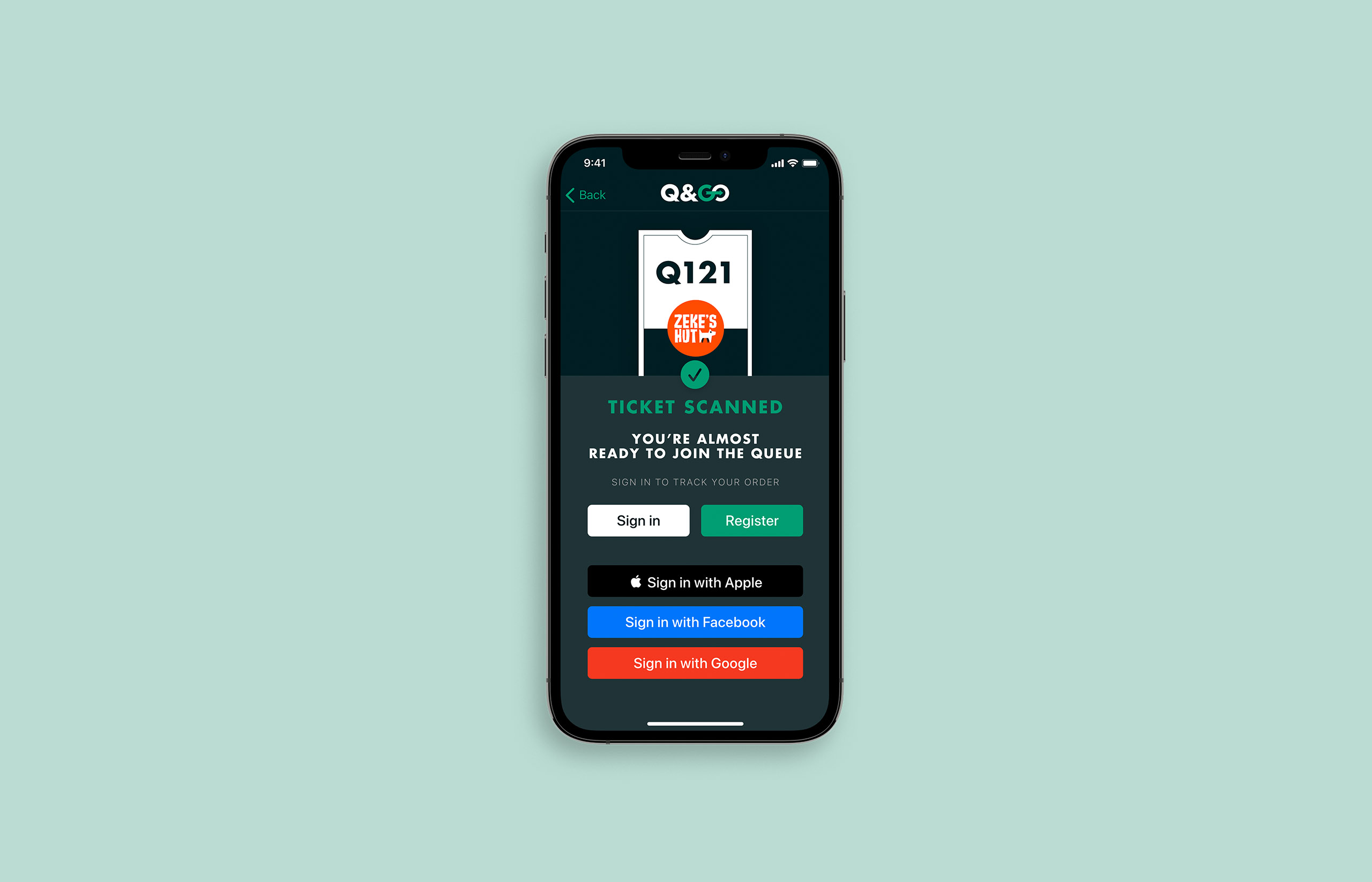
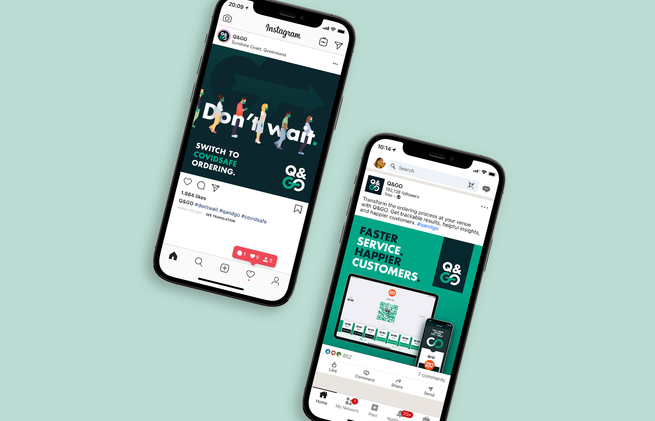
Likewise, the primary elements that comprise Q&GO’s brand voice are split into three main components. Order tickets, the Q&GO mark, and the branded QR codes themselves. Using this as a foundation, we were able to craft a simple, clear brand identity and matching app experience that is easy to navigate and keeps customer journeys stress-free.

Bold, clear, familiar
The brand identity itself had a few main goals. The logo needed to be bold, identifiable from a distance, and easily remembered. We also wanted to ensure an approachable, friendly, and high-quality tone of voice, encouraging vendors to wear the Q&GO brand on their store signage as a mark of pride.
We developed a toolkit of illustrations, typography and iconography to accompany the brand wherever it needs to shine most, whether in-store, online or in-app.

An end-to-end experience
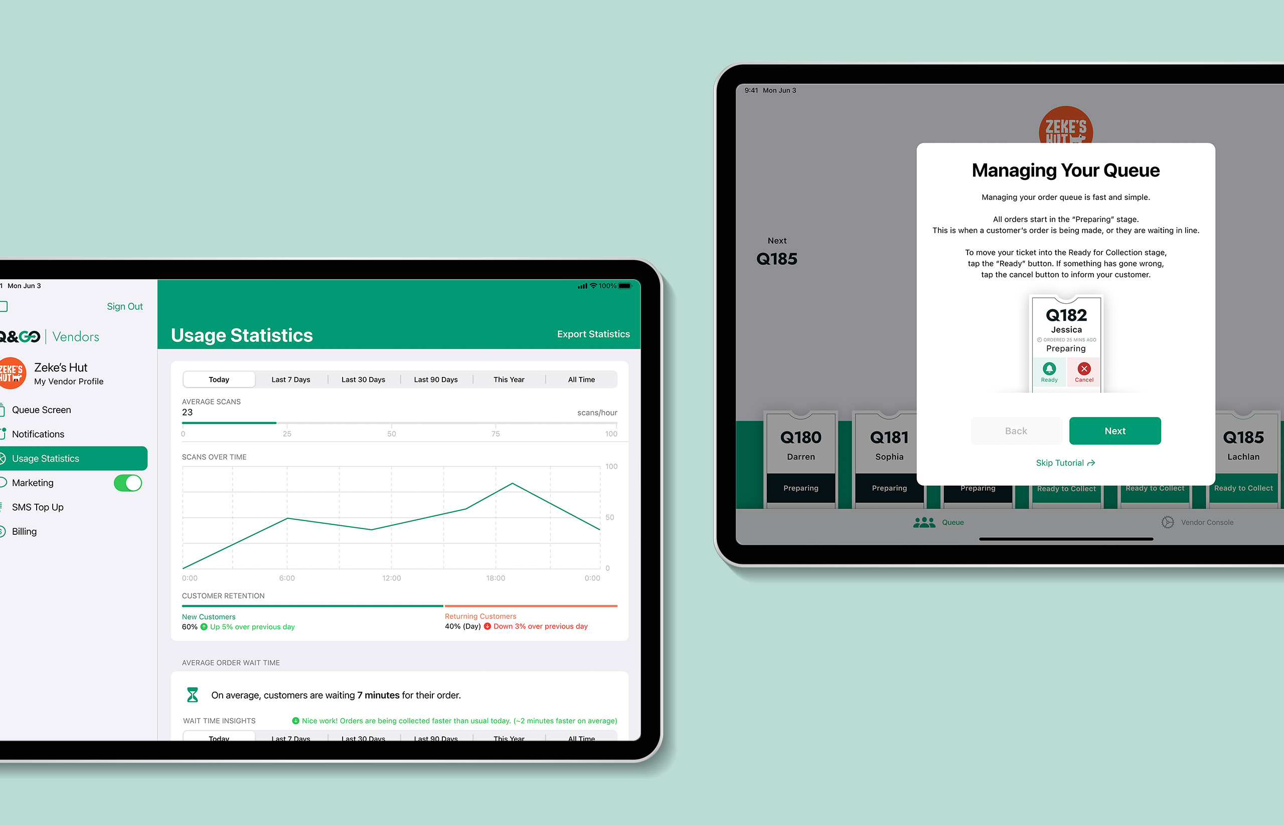
It was important to provide consistency for both users and vendor management. When designing both the Q&GO app and companion Vendor Console, we wanted to make sure there were familiar design elements that carried the brand language across to each domain.
Accordingly, the ticket-based UI carries across to the Vendor Console. The store’s Q&GO branded QR code is also displayed front and centre, meaning it can be presented by staff for users to scan at checkout.
To provide differentiation in the app’s marketing channels, the Q&GO brand colours are inverted when speaking to vendors. This carries through to the Vendor Console app experience, where the lighter green colours are preferred versus a darker palette for customer facing views.