

The Design
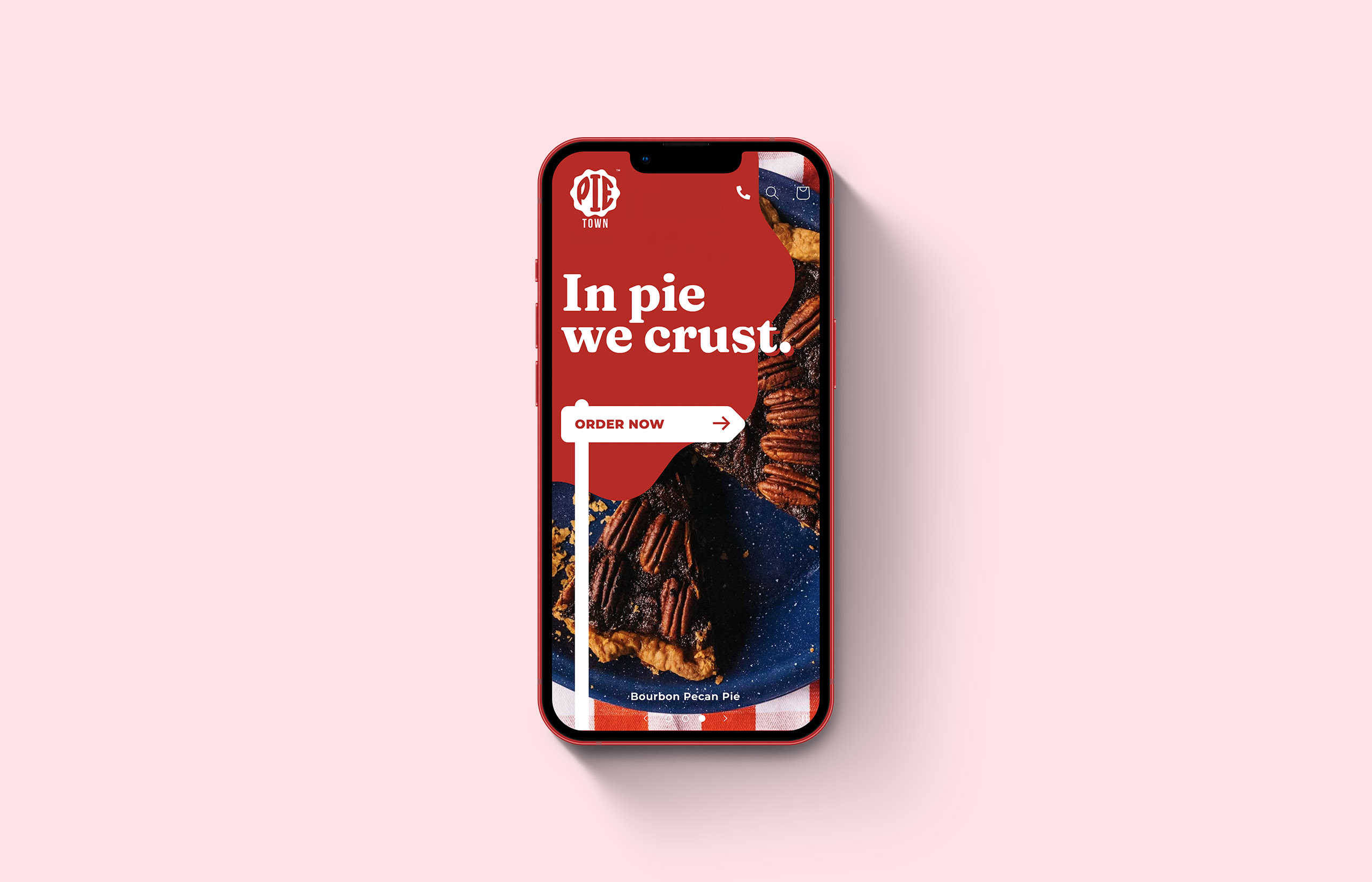
We decided to start by identifying the unique personality of the Pie Town brand. We wanted to build something that conveyed the child-like wonder of walking into a shop full of every flavour of pie you can think of.
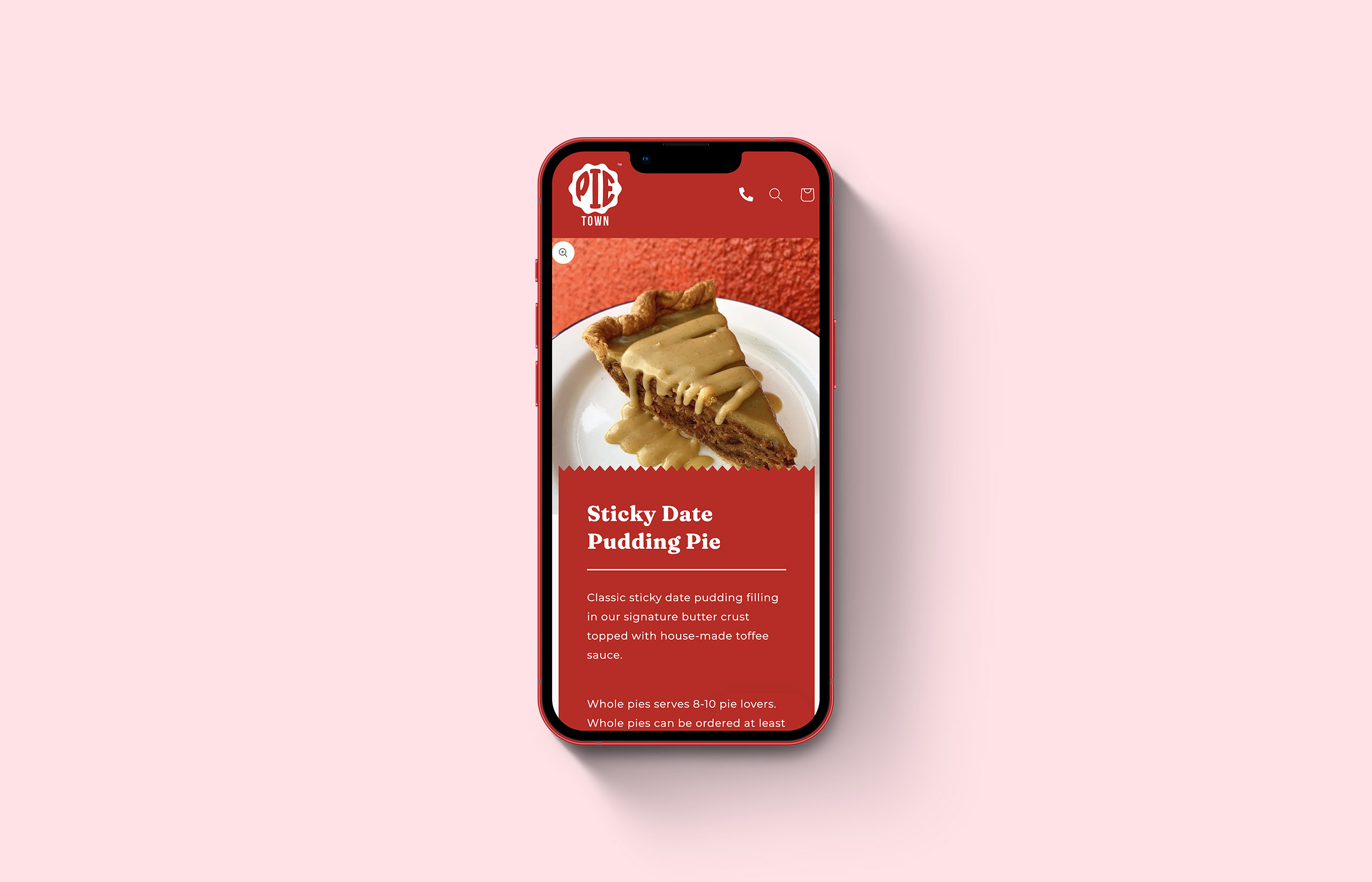
We started simple: let the pies speak for themselves. Nothing is more bright, fun and playful than pictures of sweet handmade pies. We then extended the brand throughout the entire store to create a consistent visual language: the basic shape of the existing logo, which represents a hand-crimped butter crust, is echoed throughout—as image containers, iconography, buttons and so on.
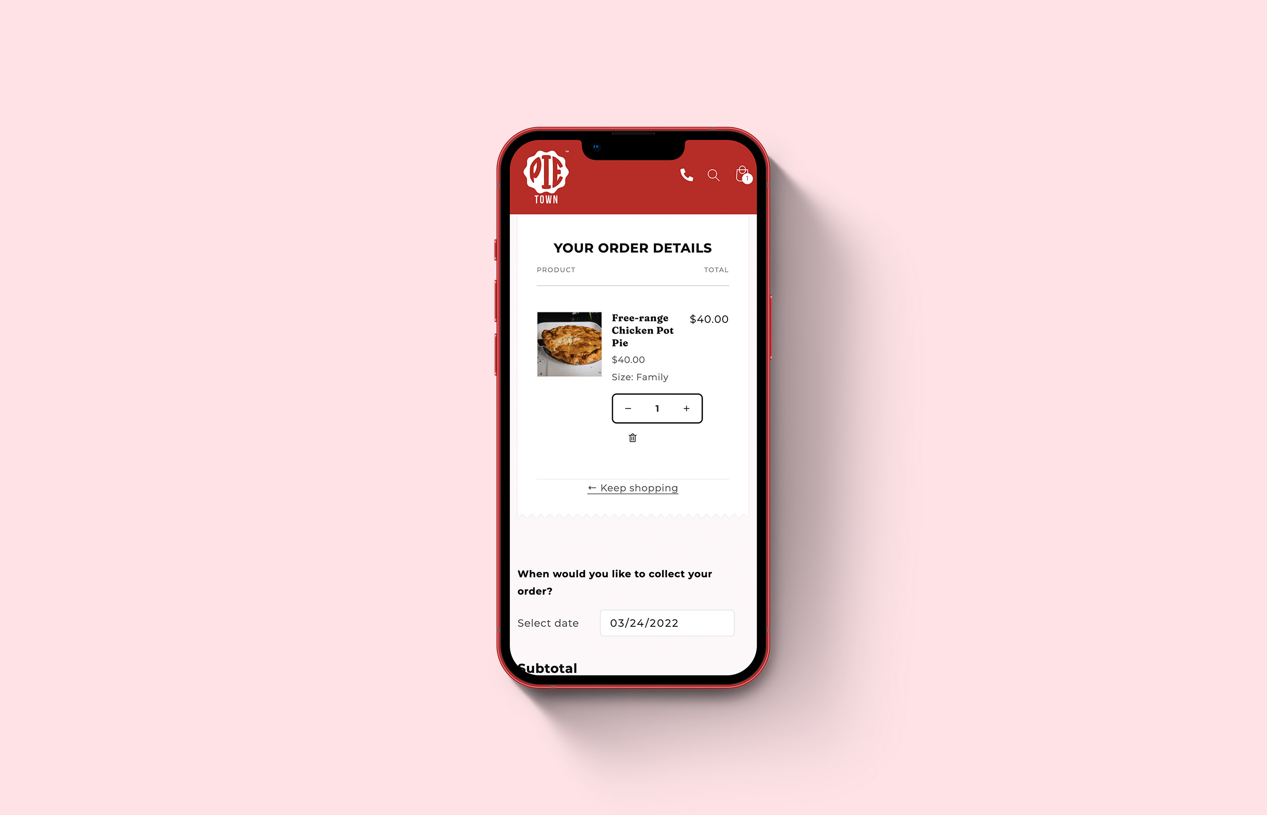
The Pie Town storefront also needed a considerable amount of user experience optimisation. We wanted to ensure that every user would be able to not only access the content, but be able to intuitively navigate the store and make orders.


One System
A major goal for the Pie Town website project was leveraging Shopify’s Point of Sale system to streamlining their entire sales process. Shopify’s fully featured POS works in tandem with its web software, meaning Pie Town was able to simplify their entire sales management process, reducing workload for staff and reducing the number of different services and subscriptions required to run the store, resulting in considerable cost savings.
Our team assisted Pie Town with migrating their product and customer data from a range of platforms, integrating rewards and subscriptions into the new system and ensuring compatibility across both sales channels.