The Concept
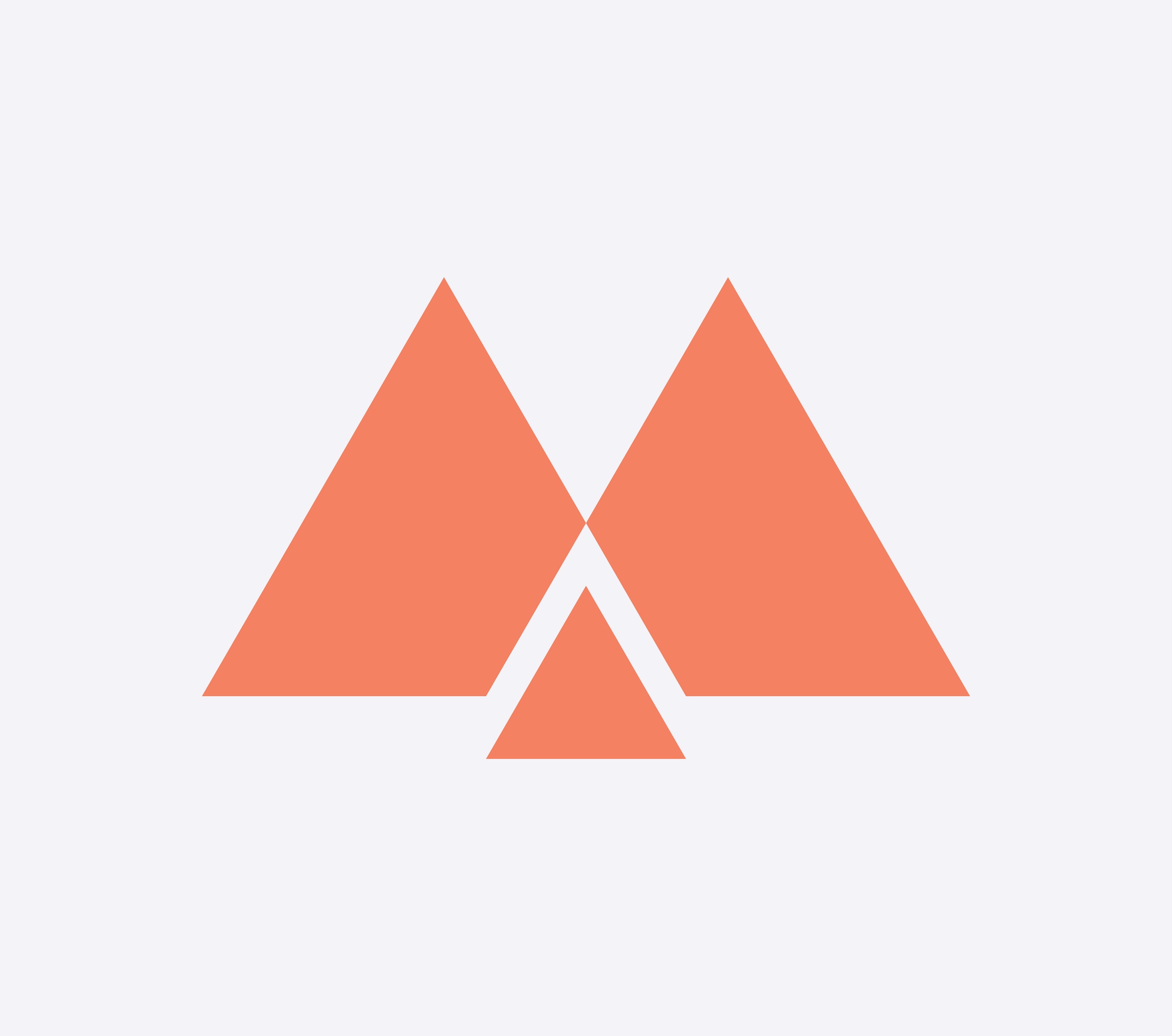
We set about creating the building blocks of the brand, and settled on a design language based around the well established iconography of the triangle – a symbol universally recognised as indicating active, play, forward, motion. This began to evolve into a unique and clearly defined brand, anchored confidently by the ‘M’ logo, a simple and proprietary brand mark.
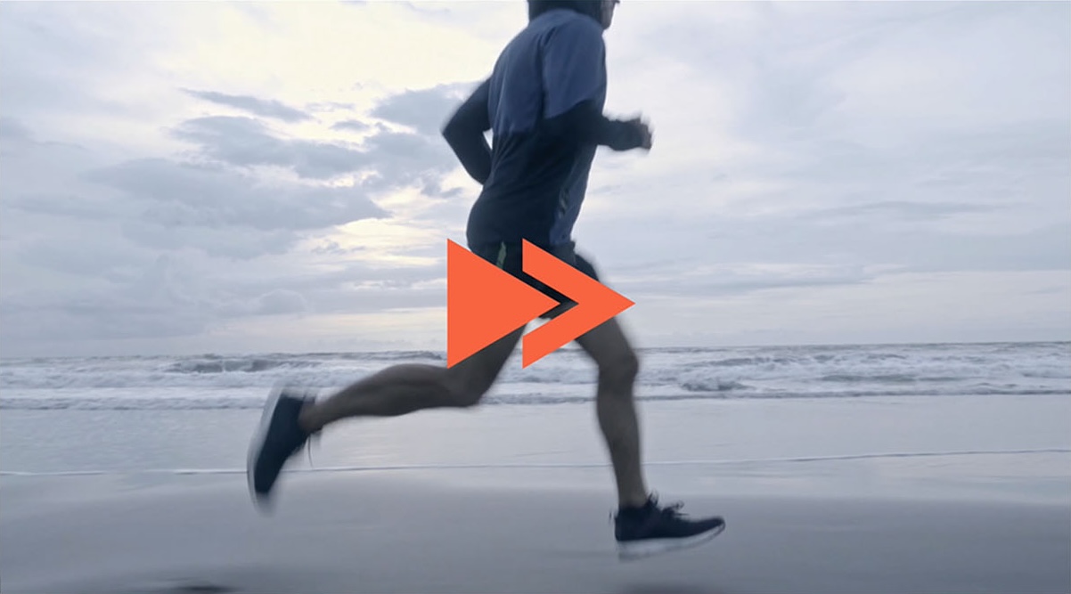
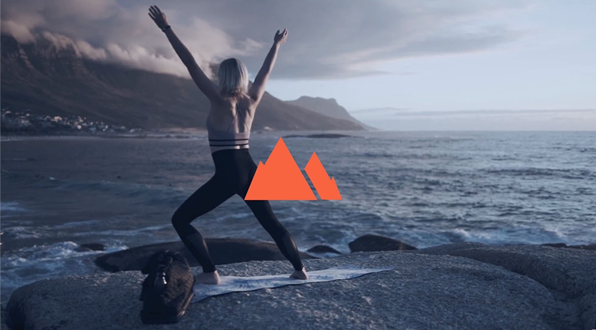
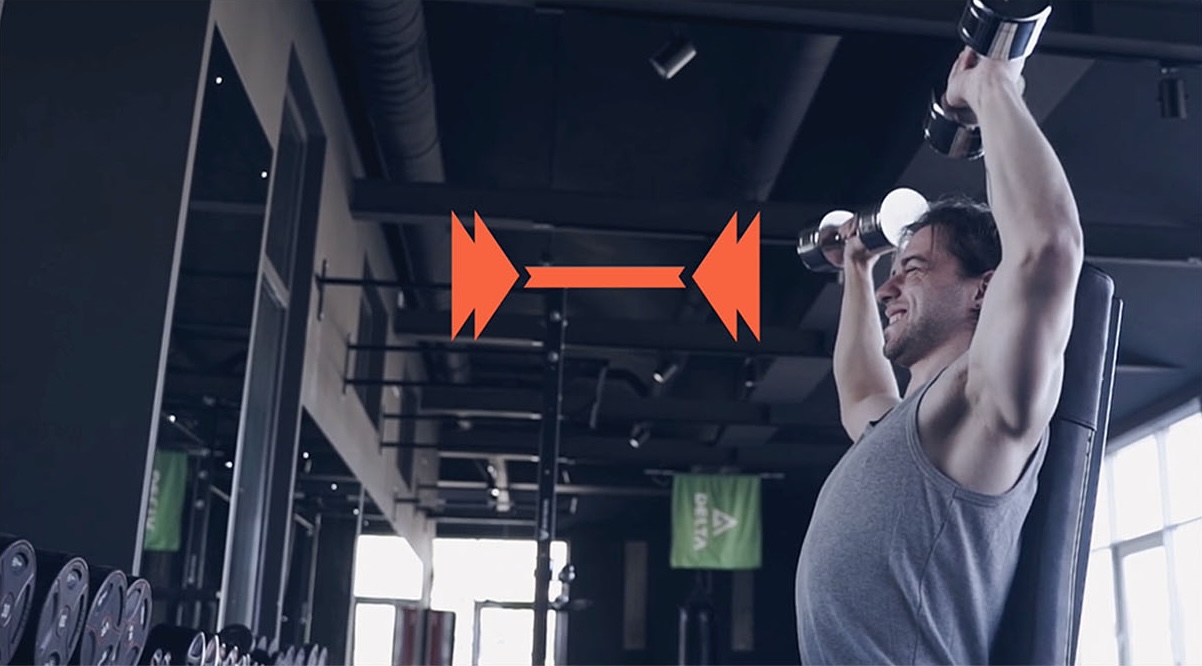
The logo doesn’t want to stay still, either — animation is deeply embedded in the brand. The logo readily transforms into a family of symbols appropriate for a range of activities — always moving, always dynamic.
The logo is paired with a series of bold brand colours, and a custom typographic treatment available in various lock-up layouts, to provide enough flexibility for any situation. The two symbols can be used in tandem, or apart, to serve as components of the overall brand, along with the brand proposition.
Taking it online
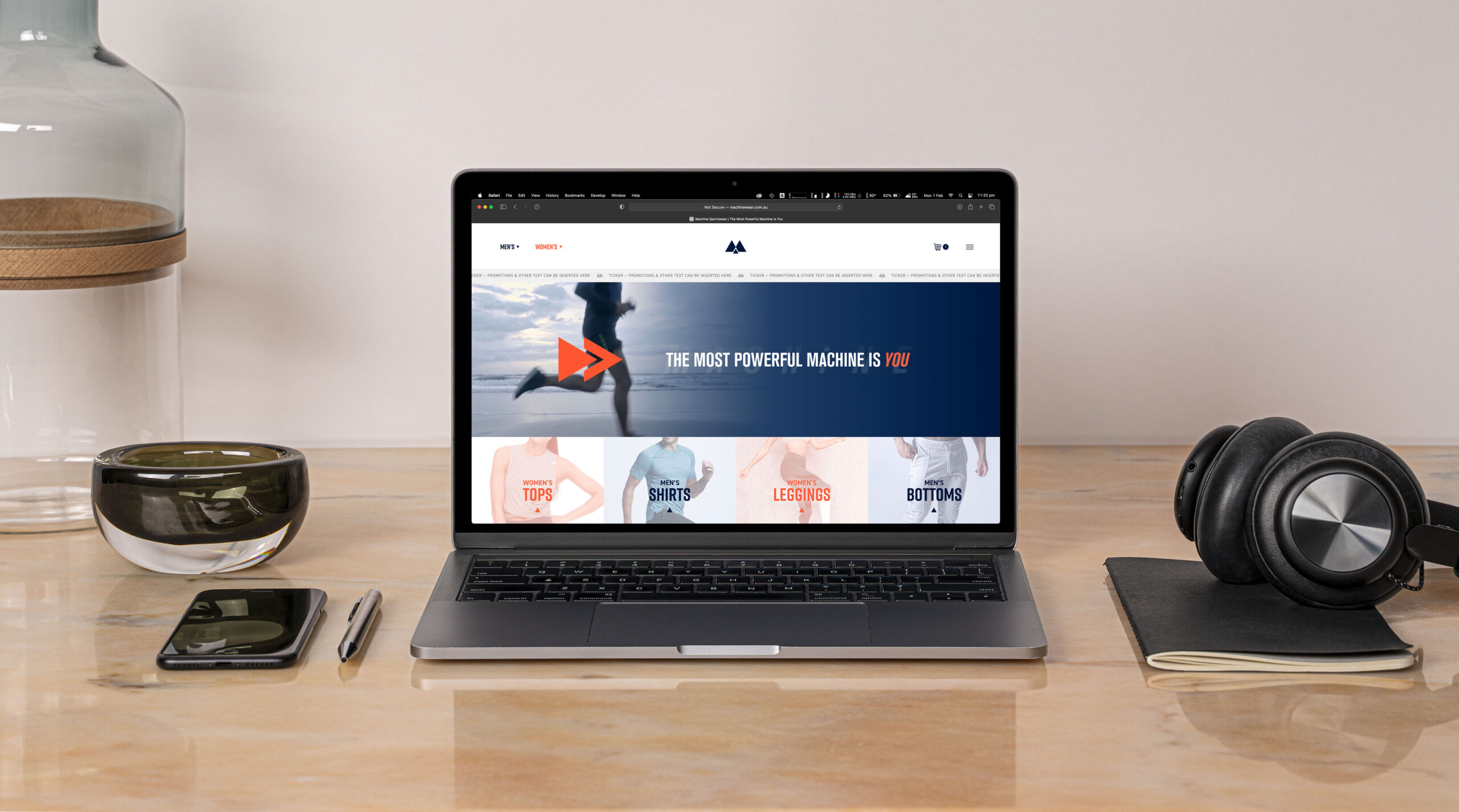
To market the brand online, we also designed and developed the Machine Sportswear e-store and website, utilising a bespoke Shopify build. The language of the master brand is echoed throughout and provides a sense of consistency across the product range.